Background
Born in 2009, KidsPlaza has 100 stores nationwide, providing more than 10,000 smart and convenient products, certified by the world for safety for children. KidsPlaza has become a true companion to millions of young and dynamic mothers across Vietnam.
Objective
After a decade of building a brand that’s become a mom’s best friend, it was time for KidsPlaza to elevate their brand to the next level and prepare for the increasingly competitive mom and kid industry. We were tasked with Brand Repositioning from the Brand Differentiation Strategy to the Brand Identity.
Action and Result
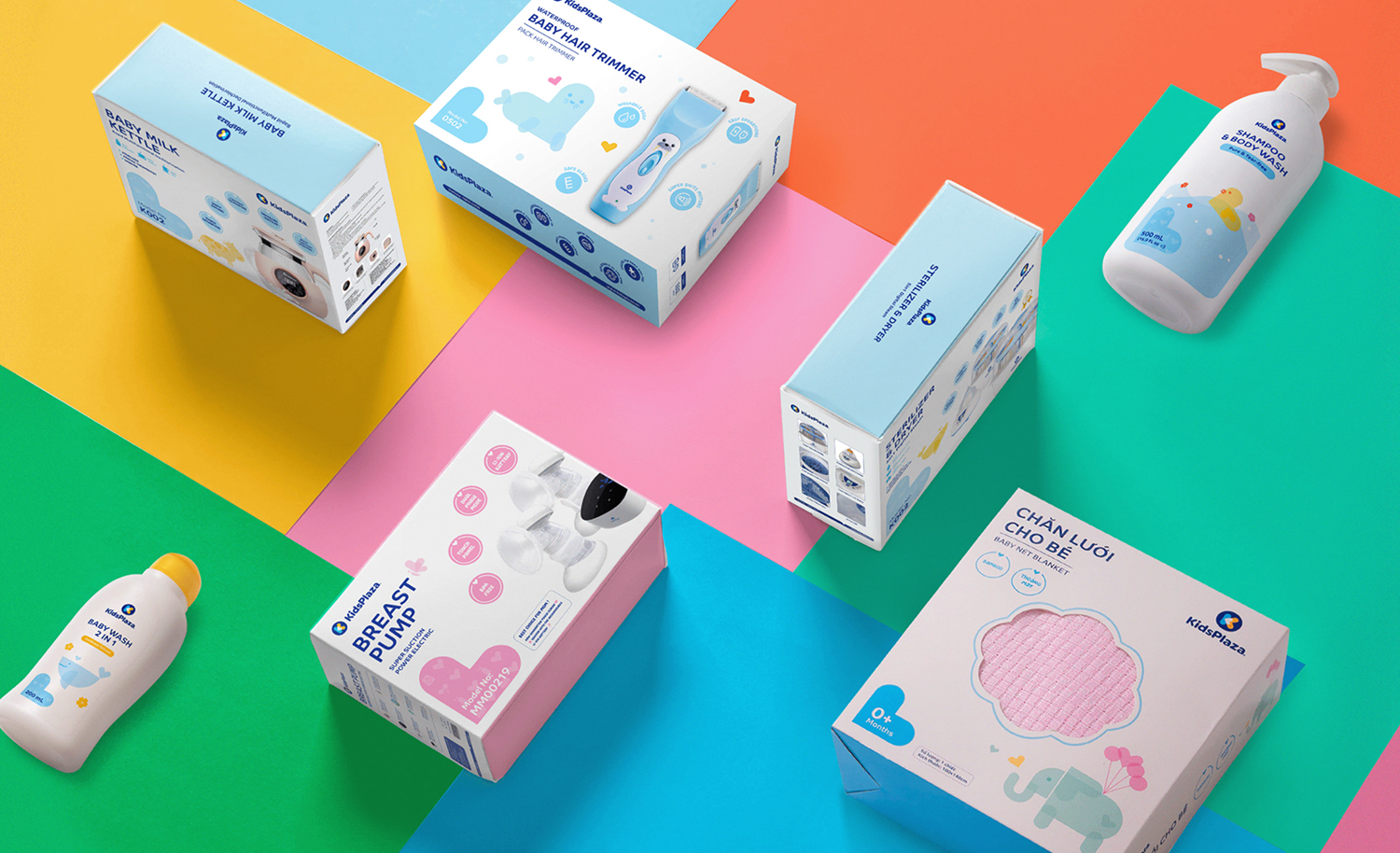
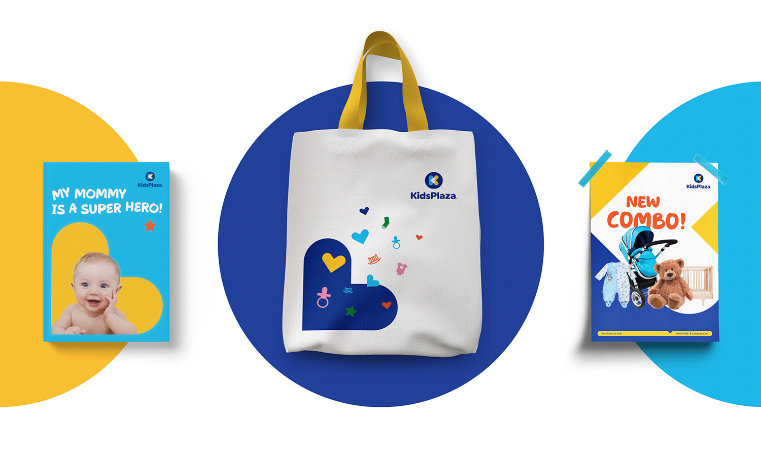
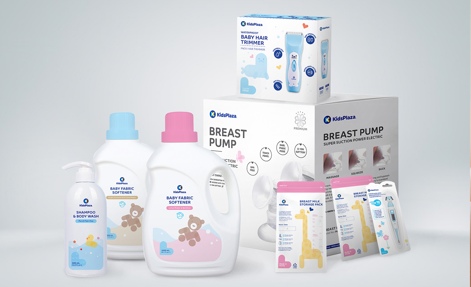
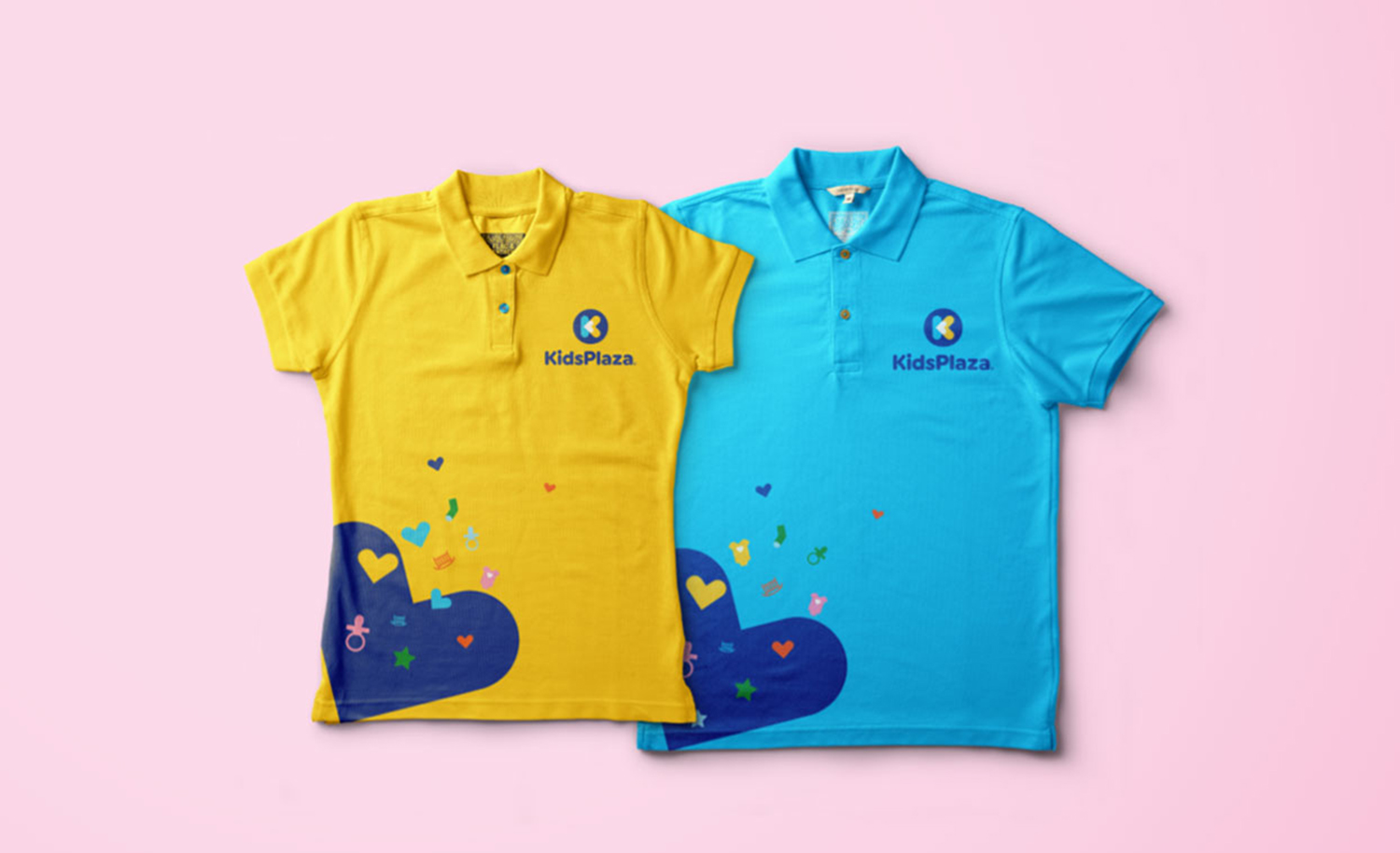
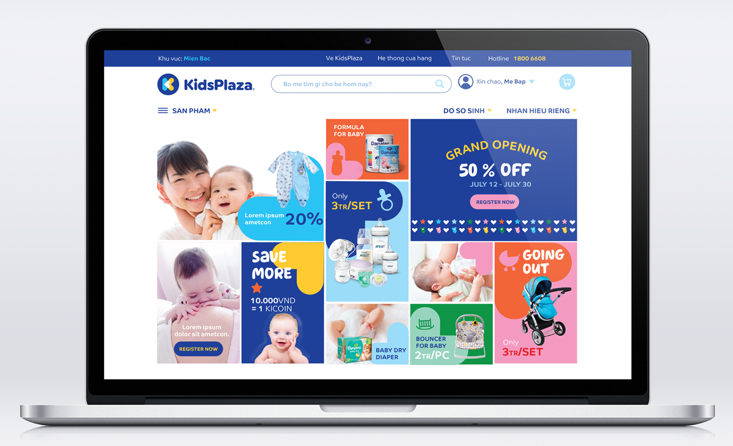
We redesigned the logo, giving the Brand Identity a simple yet modern look with a clean heart-in-heart symbol and approachable typeface for the logotype. The idea was to appeal to the wholehearted and convenient values that KidsPlaza provides to shoppers. The new Brand Identity system also consists of a fresh color palette and flexible icon system for the in-store environment and private label products. In addition to the new look and feel, KidsPlaza also enhanced its whole shopping experience with a new store design.