Background
Famous for the combination and delicate blend of all kinds of traditional Laotian ingredients, with unique flavors, and elaborate processing, Khao Lao is always the first choice when it comes to authentic Laotian Cuisine in Vietnam.
Objective
With the aim of expanding its famous Laotian cuisine restaurant chain while still upholding the sophisticated features of traditional Lao Cuisine in Vietnam, Khao Lao collaborated with us to create a Brand Identity system, including the Master Brand Format, Media Systems and Brand Guidelines.
Action and Result
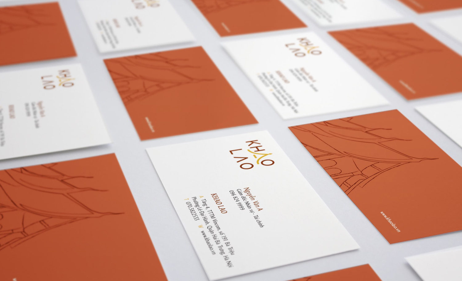
The logotype design that we created for Khao Lao highlights the unique architectural features of Laotian sacred temples. The playful symbol is applied across the Media Systems to create a consistent look and feel that accurately represents the brand character traits, namely sophisticated, close and modern. Khao Lao can be depicted as a 28-year-old female artist whose personality is the perfect combination of traditional and modern. Khao Lao’s color palette is rich in brown and gold tones, an iconic representation of Laotians’ down-to-earth nature, and the jewelry they are famous for.

