Background
ACEFIC is a pioneer general contractor in construction and civil works that ensures timely, safe and high-quality construction steadily throughout the year by means of a stable workforce using the world’s most advanced technology. Having achieved projects invested in by the most prestigious corporations in Vietnam, ACEFIC is a well-trusted brand with core values of strong partnership, dedication and hard-work mentality.
Objective
The client wanted to modernize and change the perception of a construction company from a rigid look and feel to a more comprehensive and professional brand experience.
Action and Result
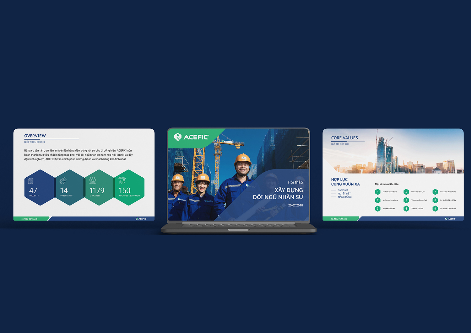
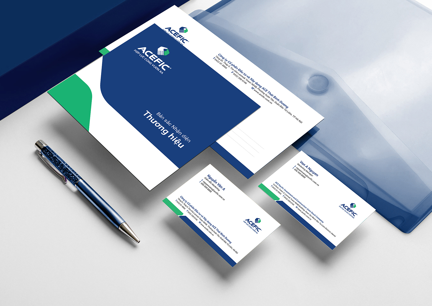
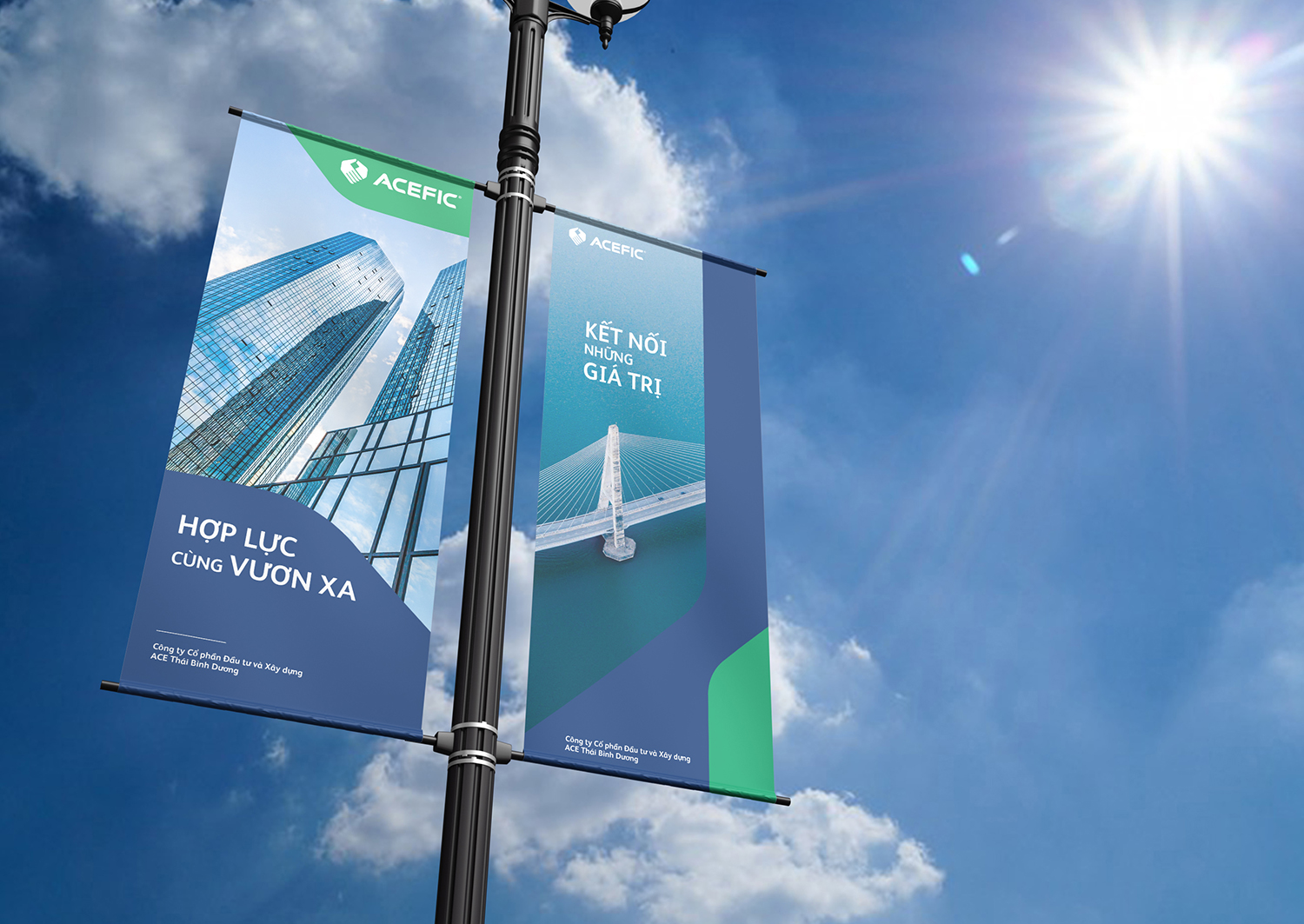
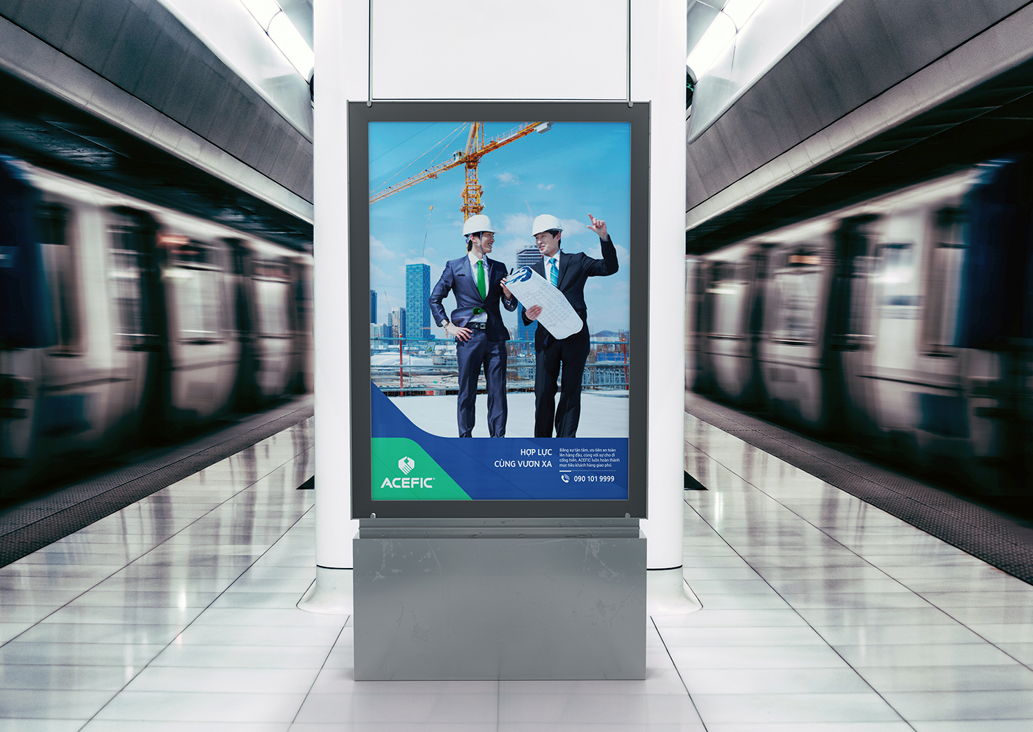
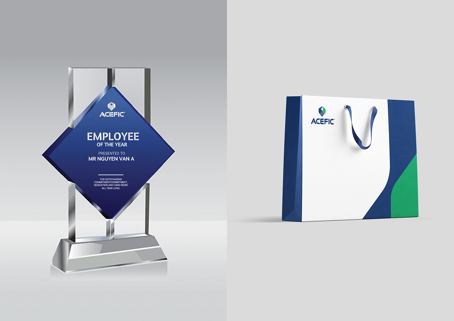
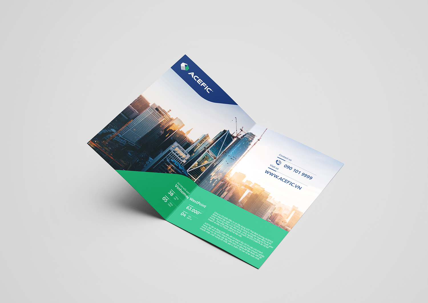
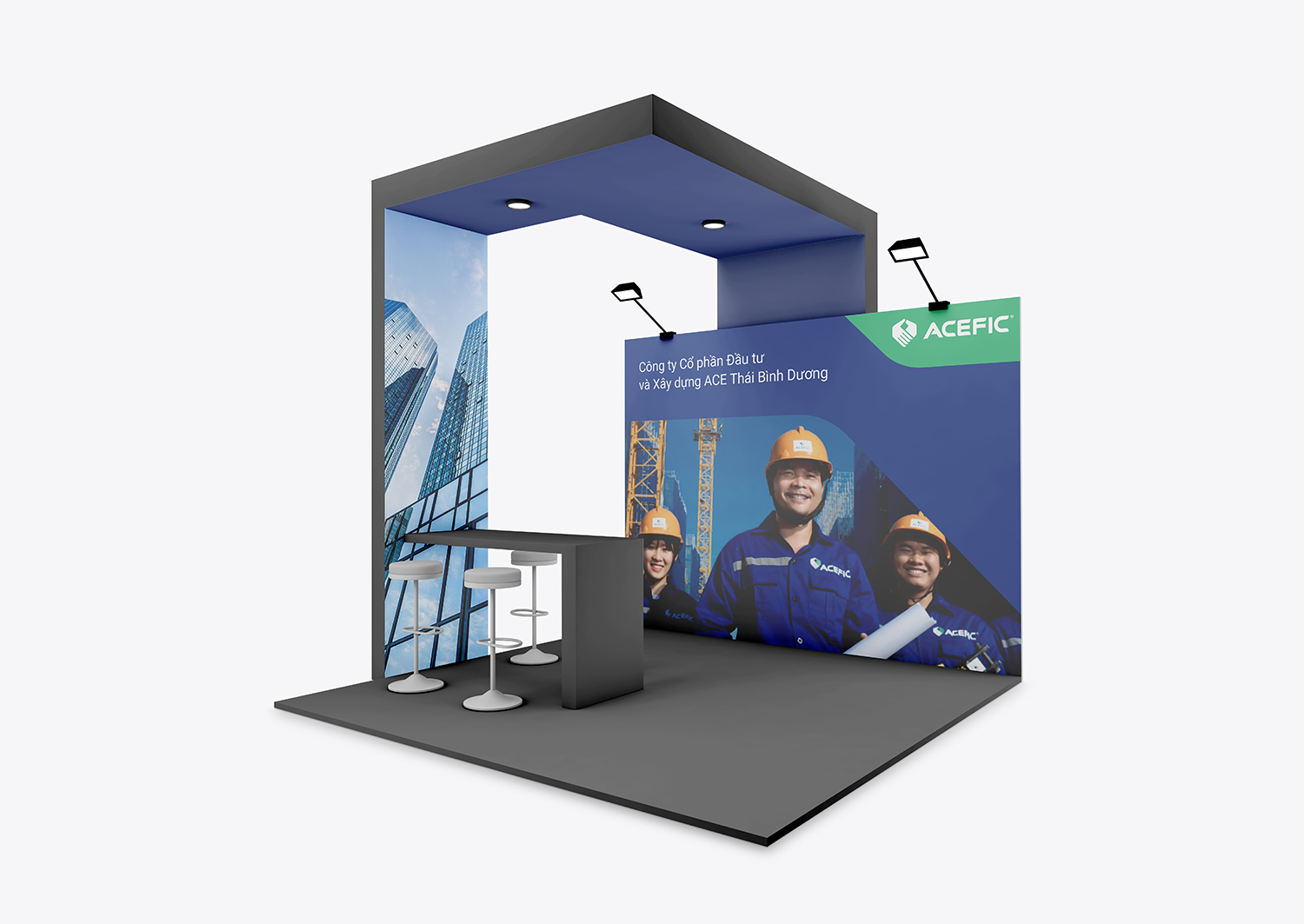
The Brand Identity was inspired by the brand name that conveys the close-knit relationship between founders of the company with the same vision. Together they stand shoulder to shoulder, hand in hand, determined to sail the ACEFIC ship across oceans to achieve greatness. The brand color palette emphasizes the use of blue and green to symbolize stability, trust, power and growth. Along with the Brand Positioning Phrase, ‘United To Go Further’, ACEFIC affirms their brand purpose to serve, create value, and fulfill their clients’ vision to build iconic developments. From top management level to engineers on their construction sites, every ACEFIC individual works in synergy to ensure the highest quality. A comprehensive Brand Identity system, from logo to Media Guideline, ensured the brand made a statement with powerful photography, a set of dynamic icons, and typefaces that convey strength, determination and honesty.
